

Landing page efectiva: Ejemplo real y plantilla GRATIS

Índice del contenido
¿Por qué tu landing page podría no estar convirtiendo?
Ejemplo real: estructura de una landing que convierte
2.1 Formulario arriba del primer scroll
2.2 Beneficio emocional en lugar de descripción técnica
2.3 Testimonios breves y bien ubicados
2.4 Menú desplegable sin fugas de atención
2.5 Repetición estratégica del formulario con incentivoPlantilla editable: diseña tu landing en minutos
Checklist para revisar tu próxima landing page
Conclusión: De visitante curioso a cliente convertido
¿Por qué algunas landing pages convierten y otras no?
Una landing page bien diseñada puede marcar la diferencia entre una campaña que genera resultados y otra que simplemente gasta presupuesto. A menudo, los errores más comunes son invisibles a simple vista: exceso de texto, botones poco claros, formularios que aparecen demasiado tarde, o elementos que distraen de la acción principal.
En este artículo analizamos una landing real y optimizada, destacamos qué hace bien y te compartimos una plantilla editable para que puedas aplicarlo hoy mismo.
Ejemplo real: estructura de una landing que convierte
Esta landing fue diseñada con un único objetivo: generar conversiones de forma directa y sin distracciones. Aquí explicamos cada bloque de la estructura y por qué funciona.
1. Formulario arriba del primer scroll
Ubicación estratégica: el formulario está visible inmediatamente, sin necesidad de hacer scroll.
Simplicidad: solo pide nombre, email y categoría preferida, reduciendo la fricción.
Incentivo claro: el botón con llamada a la acción es claro ("Probar demo gratis") y el precio posterior está bien explicado ("luego solo 15 €/mes").

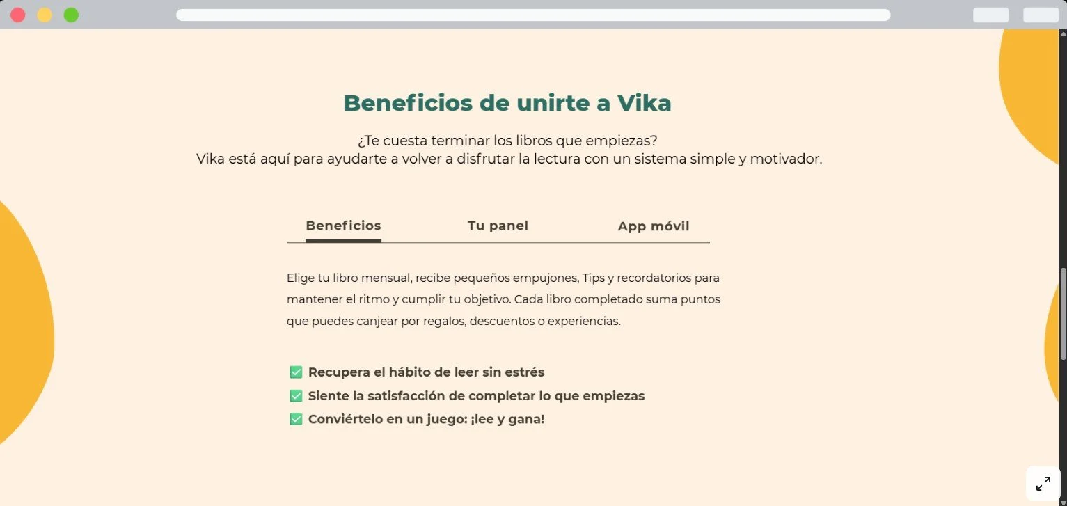
2. Beneficio emocional en lugar de descripción técnica
En lugar de describir el producto, se comunica el beneficio de forma emocional.
Frases como “¿Listo para volver a enamorarte de los libros?” o “Sin estrés, sin presión. Solo tú y las buenas historias” conectan con el lector desde lo humano.
Esto genera empatía y aumenta el interés.
Testimonios breves y bien ubicados
Los testimonios no interrumpen la navegación.
Están bien colocados en una sección secundaria, con formato conciso y claro: nombre, edad y fotografía. Generan confianza sin robar atención a la oferta principal.

Menú desplegable sin fugas de atención
La página no lleva al usuario a otros sitios.
Tiene un menú desplegable que permite ampliar información sin abandonar la landing.
Este sistema mantiene al visitante enfocado y evita distracciones que puedan frenar la conversión.
Repetición estratégica del formulario con incentivo
Al final de la landing, el formulario vuelve a aparecer.
Esta vez, se agrega un refuerzo: “50 % OFF en tu primer mes después de la demo”.
Es una segunda oportunidad para captar al usuario que no convirtió arriba, usando un incentivo adicional.

3. Plantilla editable: diseña tu landing en minutos
Hemos preparado una plantilla a modo de mockup editable inspirada en esta landing real.
Podrás adaptarla a tu negocio fácilmente y empezar a captar leads de forma más efectiva desde hoy.
Puedes usarla en tus proyectos de Canva y ajustar los textos, colores y estructura según tus necesidades, te recomendamos trabajarla junto a un desarrollador para implementarla en tu negocio o ¡contáctanos!
Como usar: al abrir la ventana, haz clic en ‘Usar esta plantilla de marca’ para crear tu propia copia y personalizarla fácilmente.
4. Checklist para revisar tu próxima landing page
Antes de publicar, revisa estos puntos clave:
¿El formulario es visible sin hacer scroll?
¿El mensaje principal comunica un beneficio claro y emocional?
¿Hay distracciones o enlaces externos que podrían desviar al usuario?
¿Se repite el formulario al final con una oferta reforzada?
¿Los testimonios refuerzan la confianza sin ocupar demasiado espacio?
5. Conclusión: De visitante curioso a cliente convertido
Una landing bien estructurada guía al usuario con claridad, sin obstáculos ni distracciones.
Cuando el contenido, el diseño y los estímulos están alineados, las conversiones aumentan de forma natural.
Con la plantilla descargable que te compartimos… ¡puedes empezar hoy mismo a aplicar estos principios y transformar tus campañas!


¿Necesitas ayuda para conseguir clientes?
Reserva una videollamada donde responderemos a tus dudas y te ayudaremos totalmente gratis a plantear la estrategia que más beneficie a tu empresa.
>>Clic aquí para una videollamada de asesoramiento gratuita<<